Every business from a small store in South Mumbai to a large company runs on numbers. But have you ever wondered how …
Imagine you are sitting in a boardroom or staring at a laptop screen looking at a spreadsheet with 10,000 rows of raw sales data from your company. Your eyes blur columns of dates, product IDs, profit margins and regional codes from different parts of the country. Inside that mountain of numbers lies the answer to why sales of your products dipped last quarter but finding it feels like searching for a needle in a haystack.

This is what business analysts, marketers and managers like you deal with every day. Raw data is powerful. In its native form it is incredibly noisy and hard to understand. That is where data visualization comes in. Data visualization is the bridge between chaotic numbers and clear actionable decisions that can help your company grow. If you are looking to build a career in this growing field finding a hands on data visualization course near Charni Road can be your gateway to turning those confusing spreadsheets into striking easy to understand visual stories that everyone can understand.
What is Data Visualization. Why Does It Matter?
At its core data visualization is the practice of translating text and numbers into a context, such as a chart, map or graph that makes sense to people. It leverages the brain’s natural ability to spot patterns, trends and outliers far more quickly than it can read text or process rows in an Excel sheet. Data visualization matters because it helps people like you make sense of data and make better decisions.
Think about how you look at a weather app on your phone. You do not read a table of barometric pressure and humidity percentages to decide if you need an umbrella you look at an icon of a rain cloud or a simple percentage trend line that tells you what the weather will be like. Data visualization works in a way making it easy for people to understand complex data.
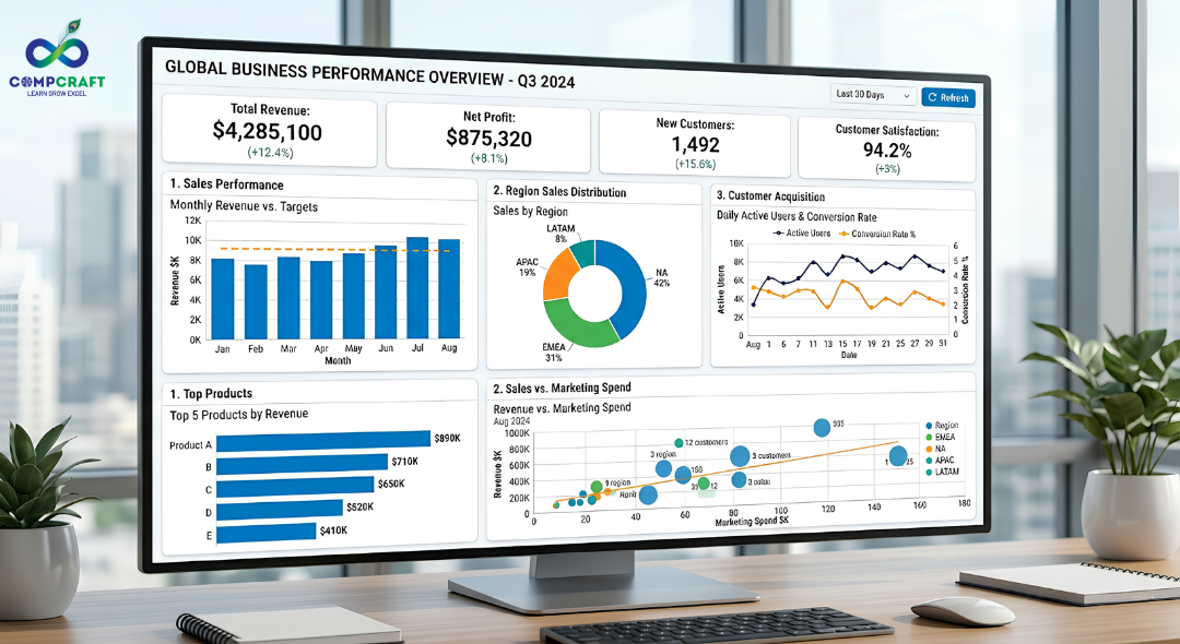
In the world visualization is critical because businesses move too fast to read dry reports. A constructed dashboard lets a CEO see the health of a company in under ten seconds. It changes data from an archive into a forward looking tool for strategy that can help companies make better decisions.
The True Power of Simplifying Complex Data
Simplifying data is not about making it basic or stripping away its substance. True simplicity means removing friction, which is the mental effort people need to put in to understand something. When a report is cluttered the viewer spends much mental energy trying to figure out what they are looking at rather than thinking about what the data actually means. Simplifying data helps people focus on what matters.
Consider an example an e commerce brand trying to track customer returns of their products. If you present a 50 page text document detailing every returned item the management team will struggle to see the picture.. If you simplify that complexity into a single heat map showing that 80% of returns happen because of sizing issues in just two clothing lines the business can take immediate action to fix the problem. Simplifying data saves time reduces miscommunication and drives execution.
Core Data Visualization Techniques You Must Master
Creating a visual requires a mix of analytical logic and clean design principles. Here are the core techniques that separate dashboards from professional insights:
1. Choosing the Right Chart Type
This is where most beginners trip up. A pie chart with twenty slices is unreadable. A line chart tracking fifty products looks like a bowl of tangled spaghetti. You must match the chart to the relationship you want to show. For example:
Bar Charts are best for comparing categories like comparing sales of different products across five different store branches.
Line Charts are ideal for showing trends over time like revenue growth across a fiscal year.
Scatter Plots are perfect for showing relationships or correlations between two variables like ad spend versus website traffic.
Pie Charts should be used sparingly and when showing components that add up to a clean 100% using a maximum of three to four slices.
2. Storytelling With Data
A collection of charts without a narrative is a collection of charts. Data storytelling means guiding the viewer through a journey. Start with the critical high level metric, like total net profit break it down by the contributing factors, like regional performance and then pinpoint the areas needing attention like the lowest performing region. Your dashboard should answer the questions “What happened?” “Why did it happen?”. “What should we do next?” in a sequence.
3. Smart Use of Colors and Visual Hierarchy
Color should never be used to make a chart look pretty. In reporting color is a tool for communication. Use a palette, like grays and soft blues for the background and standard data points and reserve high contrast colors like a sharp red or amber to highlight critical anomalies or missed targets. Visual hierarchy means making the important things stand out first. Large bold numbers for Key Performance Indicators should live at the top left of the screen because that is where the human eye naturally begins reading.
4. Dashboards vs Reports
Understanding the difference between these two formats is essential for business analytics:
Dashboards are real time interactive screens that offer a high level overview of operational performance and allow users to filter data on the fly.
Reports are typically documents created at specific intervals like monthly or quarterly PDFs, that provide deep context, historical records and detailed written commentary.
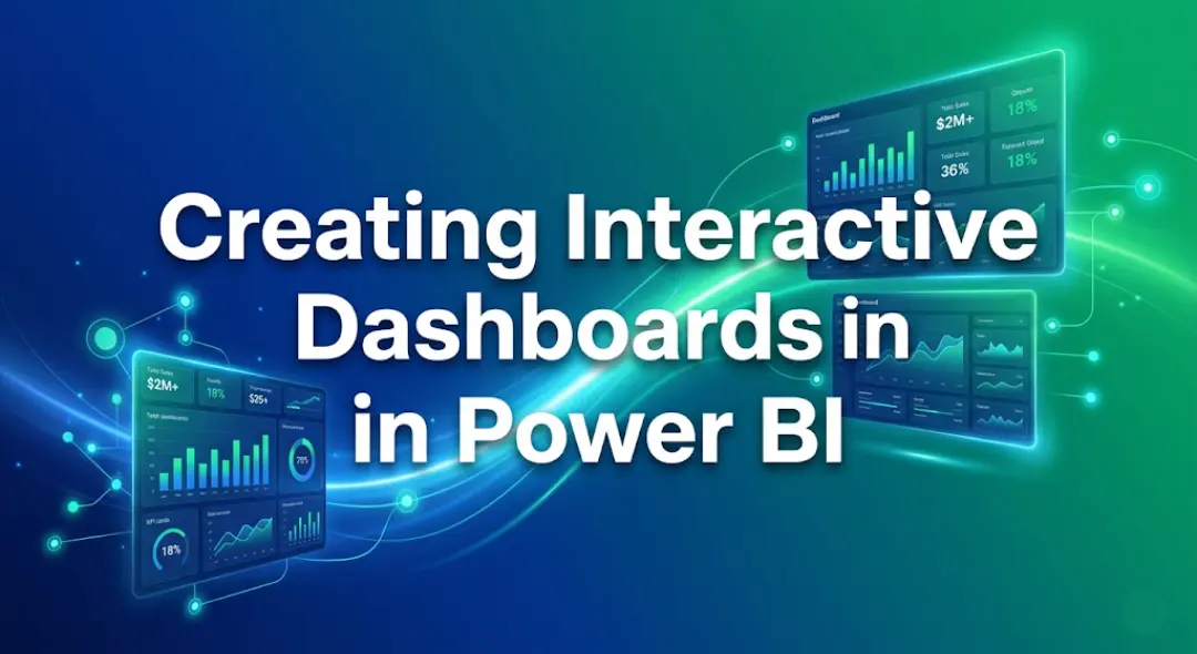
The Role of Power BI in Modern Visualization
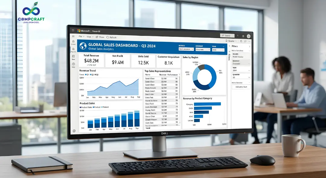
While tools like Excel are great for tracking modern corporate intelligence relies on dedicated platforms like Power BI. Power BI has emerged as an industry leader for this reason. It allows you to connect to hundreds of data sources from a desktop Excel sheet to massive cloud databases and transform that data with minimal effort. Using Power BI reporting you can build interactive ecosystems where clicking on a specific bar in a chart instantly filters every other visual on the screen. It takes care of the lifting behind data modeling allowing analysts to focus on extracting insights rather than manually building charts every single week. Gaining proficiency in these platforms through focused Power BI training in Charni Road gives you a competitive edge in the job market.
Common Mistakes Beginners Make
When starting out with business analytics it is easy to overcomplicate things. Watch out for these design traps:
Overloading the screen Trying to cram every metric onto one page creates a wall of noise. If everything is emphasized nothing is emphasized.
Misleading scales Starting the Y axis of a bar chart at something than zero can artificially exaggerate minor differences between categories leading to skewed interpretations.
Inconsistent formatting Using four fonts, erratic text alignments and random color schemes makes a dashboard look unprofessional and difficult to navigate.
Practical Tips to Improve Your Dashboards Immediately
If you want to make your work look more polished and professional today apply these adjustments to your next project:
- Embrace Whitespace Leave breathing room between your charts. It gives the viewers eyes a place to rest. Helps organize distinct sections of data.
- Label Everything Avoid abbreviations. Make sure your chart titles explain what the data represents, like “Q3 2026 Regional Sales Distribution” instead of just “Sales Data”.
- Design for Your Audience A technical team might want granular scatter plots but an executive team usually wants clean top line summary metrics. Always build with the user in mind whether it is your boss or your team.
Turning Visual Skills into Career Growth
Mastering data visualization is one of the practical ways to accelerate your professional growth. Whether you are a student preparing for your job or a professional looking to move into a managerial role the ability to look at chaos and present clarity is a highly valued asset. Data visualization skills can help you stand out in a job market and make a real impact in your company.
If you are looking to learn these skills through real world scenarios CompCraft offers an intensive hands on training program right in your neighborhood. Signing up for a data visualization course, near Charni Road will teach you how to master top tier tools design clean dashboards and build data stories that help businesses make smarter choices. Stop drowning in rows of numbers start turning your data into insights that demand attention from your team and your boss.


Hey everyone! If you have ever walked into a shop in Mumbai, bought a laptop, or even ordered food online, you have …

If you are new to business or managing accounts in Mumbai, you have probably heard the term ledger quite often. It sounds …
Introduction Have you ever bought a smartphone from an electronics shop and received a printed paper showing the amount you paid along …

Introduction: The Hidden World Behind Your Screen If you pick up your phone right now, what is the first app you will …

Every morning most of us in Mumbai wake up and instinctively reach for our phones. We check WhatsApp scroll through train updates …

Every week at our center I get the exact same question from students. They walk in look at the course list and …

Have you ever wondered what happens behind the scenes of your apps like Instagram, Spotify, or Netflix? Every time you scroll through …

If you want to get into the data analytics field or if you want to improve your skills you probably have a …

If you have spent any time on Instagram, LinkedIn or any other new platform that has come up, you have probably noticed …

Think about the last time you asked someone for directions and ended up completely lost. It wasn’t because they didn’t know the …

Have you ever wondered why your phone can instantly unlock by looking at your face while a traditional computer program still struggles …

Imagine you want to hire a chef for your fancy restaurant.. Instead of hiring someone who already knows how to cook you …

The interview is going well until the hiring manager slides a laptop across the mahogany desk. “Here is a raw export of …
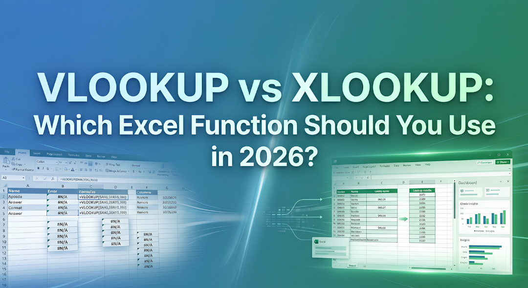
Have you ever spent three hours building a report only for it to completely break because you inserted a single new column?. …

A Pivot Table in Excel is a tool to analyze data. It is 5:30 PM on a Friday. Your manager comes to …

Imagine you have just opened a high-end boutique in the bustling lanes of South Mumbai. You have the inventory, and the decor …
Have you ever been sitting at a cafe near Marine Lines chatting with a friend about needing a new laptop only to …
Data is everywhere. Numbers and columns do not tell a story on their own. If you have ever tried to share a …